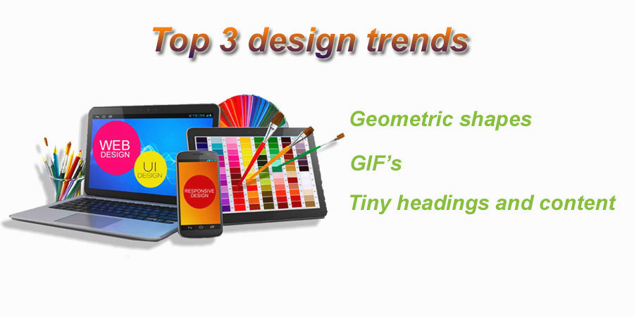
Top 3 design trends

A very easy way to catch viewer’s attention is to twist your graphic slightly. Once you do this, you can work wonders with the simplest graphic and website designs. Synaptic India a leading website designing and digital marketing firm, is of the view that the following trends have helped their clients reach out to a wider audience.
Top 3 design trends
Geometric shapes
Euclid, when he introduced Geometry in ancient times, little knew that the science would find application in graphic designing. Stemming from Google’s material design, geometric layering has emerged as an interesting concept in this sphere. Circles, squares, triangles and other geometrical shapes help the designer to bring something particular in the graphic to focus. Smartly used shapes done in bright colour borders are good enough to draw a viewer’s attention bang on target.
GIF’s
Small videos have made a grand entry in form of GIF’s in 2017. While these vector images ensure that the user does suffer a lag in their device while viewing it, they speak volumes within a short duration and are good enough to catch attention. Off late GIF’s are in vogue and are being used as a wonderful designing tool to stay ahead of competition.
Tiny headings and content
Gone are the days when the headlines used to be several font sizes bigger to get noticed. Instead, the trend has been replaced by tiny text. Smaller texts are now being used to give the designer more space to play around with and create other elements in the background. While the designer does this, he ensures that the focus is not removed from the text and ease of readability is maintained.
To know more about latest trends and apply them to your website, banners, social media cover page, etc, Contact us at pradeep@synaptic.in


